Introduction
The US government’s 311 non-emergency service line’s mission is addressing the complaints of residents, finding out information about services or reporting problems like road blocked or damage and so on. In this project, NYC 311 Service data will be explored and analyzed to understand diverse patterns, regular themes, and trends as well as the satisfactory levels of the social network which is derived from the categorical resolutions.
Project Goal
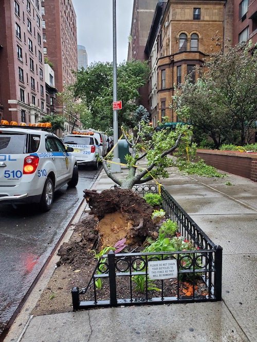
Damaged Tree and Dying/Dead Tree data of last two years 2020 and 2021 has been taken for this project to analyze the time frame for the increase in calls for damaged tree and its causes through out each borough. This will help the residents have a timeline when the problems are more frequent and take necessary precautions from car, property, or road damage.
Research Questions
About 166000 calls were made from January 2020 till January 2022, reporting damage, dying or dead trees in New York City through the service of 311. This project will explore through the reports of these damaged trees based on Boroughs to find out if there is a connection between the time of the year and season. Another data set from Tree Census 2015 will be explored to see the areas where there are more trees in poor conditions on each borough which might be a hazard alert for sidewalks/curbside or other public and private properties.
Audience
There have been times during Christmas, when I have experienced each neighborhood complain about trees being left on the curbside and not being addressed properly. At the same time, during the summer with rain or storms and natural disasters, there are situations when a tree brunch would fall on the streets, car, houses and so one. There are possibilities that each time of the year has an impact on these complains. Perhaps the number of complaints is much less in winter than summer. If so, developing a visualization through these data set might help for people to stay cautious during that time of the year and in the specific boroughs. Thus, it is worth exploring the data for complaints based on the borough over different months of the year and understand the pattern.
Data Source
Both the data, 311 Services and Tree Census 2015, were gathered from NYC OpenData. The 311 data is filtered with the specific complaint type “Damaged Tree” and “Dead/Dying Tree” for the last 2 years, 2020 to 2021. The Tree Census 2015 has been filtered by the condition of the tree by “Poor” and whether or not the sidewalk was damaged. The data includes location, complaint types, date created and many more information to explore.
Visualization
First visualization is the map of NYC, showing boroughs, separating each with different colors, and descriptors to show the type of complaints made. As you glide along the map, you can see the type of complaints made in the borough.
The second visualization is a line graph. The data is separated into year 2020 and 2021. Each line represents the borough along with the months on the row and number of complaints on the column. The highest peak shows the high volume of calls made by the people of that borough. From the graph, it can be easily depicted that the year 2020 had more calls than 2021. Month of August in 2020 had the most calls from Queens borough. Whereas, the month of July in 2021 had the most call in Queens borough. Overall, Queens had the most complaints.
In order to see and compare the complaints in the last 2 years a bar chart is created. I choose the bar chart as there are just five boroughs (i.e. they are discrete categories of data), and a bar chart is easy to display and compare the frequency of complaints made by different boroughs. From the display is it seen that Queens had the most complaints than any other boroughs in the last 2 years.
Lastly, the Tree Census 2015 data is used to create a map where the tree problems have been addressed and distributed throughout each borough. The colors on the map are based on the problems addressed in the data. This map can help understand the location with more trees and expected compliant increase.
The analyses performed with the NYC 311 Data will represent the month of the years when the complaints are at peak. The visualizations will raise awareness to the local service providers about the topics of impact and the wellbeing for the citizens. I look forward in addressing the problems in more efficient and effective way to narrow down the possible solutions. Further research can include the Tree Census Data where there can be comparison where or not the number of tree species based on each borough has an effect on the overall outcome and increase in the number of complaints. The patterns of the finding can help address the problems and lead to a better target solution for the Department of Park and recreation. Another question arises in my mind is that if there is any data that can give the categories for insurance policies. If there are any insurance policies available for these natural disasters or any natural cause for the damage of private properties, then this research can lead to a very helpful and resourceful outcome. Looking forward for more in-depth research in this topic. Below is the overview of the tableau work.